On Arny
Arnold Böcklin is the quintessential font to signify Art Nouveau*. It is such an obvious shorthand that to most designers, using Böcklin feels a little lazy. While not reaching Comic Sans levels of fame, it sits comfortably in the C-tier of typeface celebrities. But its wide popularity has allowed it to branch out beyond the obvious, into everyday applications. To me, that’s where Böcklin really shines: not in the confines of Mucha or Gaudi-themed tourist slop, but on a can of sausages. A poster for a DJ set. A vinyl record of bird sounds.

Source: FontsInUse (who else?)
Here, Böcklin can shine in its own weird, tentacle-y way, its aura speaking beyond the shackles of trend and connotation. Here, it has reached Font Enlightenment.
Arnold’s youth.
At the turn of the 20th Century, a spectre lingered over Europe — the spectre of Art Nouveau. Old aesthetic norms were challenged in every branch of the arts, from architecture to painting. Letterforms, too, were reconsidered, making way for weird contrast models and vine-like swashes — initially pioneered by graphic artists and signpainters, though metal typefaces soon followed.

Model alphabet for signpainters, from Lettres et Ensignes, Etienne Muller. ~1900.
Attempting to capitalize on the trend du jour, the Stuttgart-based foundry of Otto Weisert released Arnold Böcklin in 1904, named after the well-known Swiss painter who had died three years prior.

The original Arnold Böcklin, as published in Petzendorfer's Schriftenatlas
Who designed Böcklin is unknown. This is not an uncommon tragedy for fonts of the era: many were made by foundries in-house, by craftspeople who received no credit for their creativity and labor. We can hope, optimistically, that the anonymous artist was compensated well.
Here’s another sad (if surprising) fact: Arnold Böcklin was very likely not a commercial success. As any contemporary type designer can attest, some fonts sell; some fonts don’t. Otto Weisert was a small, regional foundry, likely selling primarily to printing businesses around Stuttgart. Ephemera is rarely preserved, let alone catalogued, but I have been unable to locate any examples of Arnold Böcklin in use from the first half of the 20th century — whereas other Jugendstil typefaces from the era, like Eckmann and Herold, have a large pre-war footprint. It is fairly safe to extrapolate that Böcklin was simply not a hit.
But the typeface was saved from obscurity. Designer and educator Ludwig Petzendorfer included a full character set of Böcklin in the 1903–1905 edition of his Schriftenatlas, an extensive catalogue of lettering, monograms and display typefaces from various foundries around the Western world. Mr. Petzendorfer happened to be a native Stuttgarter himself, which might well have helped a fairly obscure typeface like Böcklin make the cut.

Cover of the 1903-1905 edition of Petzendorfer's Schriftenatlas
Arnold the late bloomer
In the 1960s, Art Nouveau saw a new day when hippies and bohemians repurposed the ideas of their grandparents in the Psychedelia and counterculture movements, pushing away from the Swiss minimalism and grids that dominated the prior decade’s design. Type technology had changed too, with metal type being replaced by phototypesetting. The introduction of transfer lettering had lowered the capital investment required to use fonts, spurring a DIY culture and increasing the demand for variety ever further.
Arnold Böcklin, neatly preserved in Petzendorfer’s Schriftenatlas like a fly in amber, was rediscovered and released for the new era (alongside a slew of other 1900’s typefaces, in what Florian Hardwig calls “The Petzendorfer Impact”).
While it is unclear who officially was the first to pick up Böcklin, it was an instant hit. By the late sixties, Böcklin was everywhere. It was re-released by various transfer lettering and diatype manufactures, including Letraset, Mecanorma, Dymo and Face.

Arnold Böcklin on Letraset
Sixties and seventies ephemera, book covers, and other printed materials using Böcklin are easy to find. Ever on the cultural Avant Garde, musicians proved an especially willing host for the newly popular typeface, which can be spotted on hundreds if not thousands of album covers in a decade’s span.


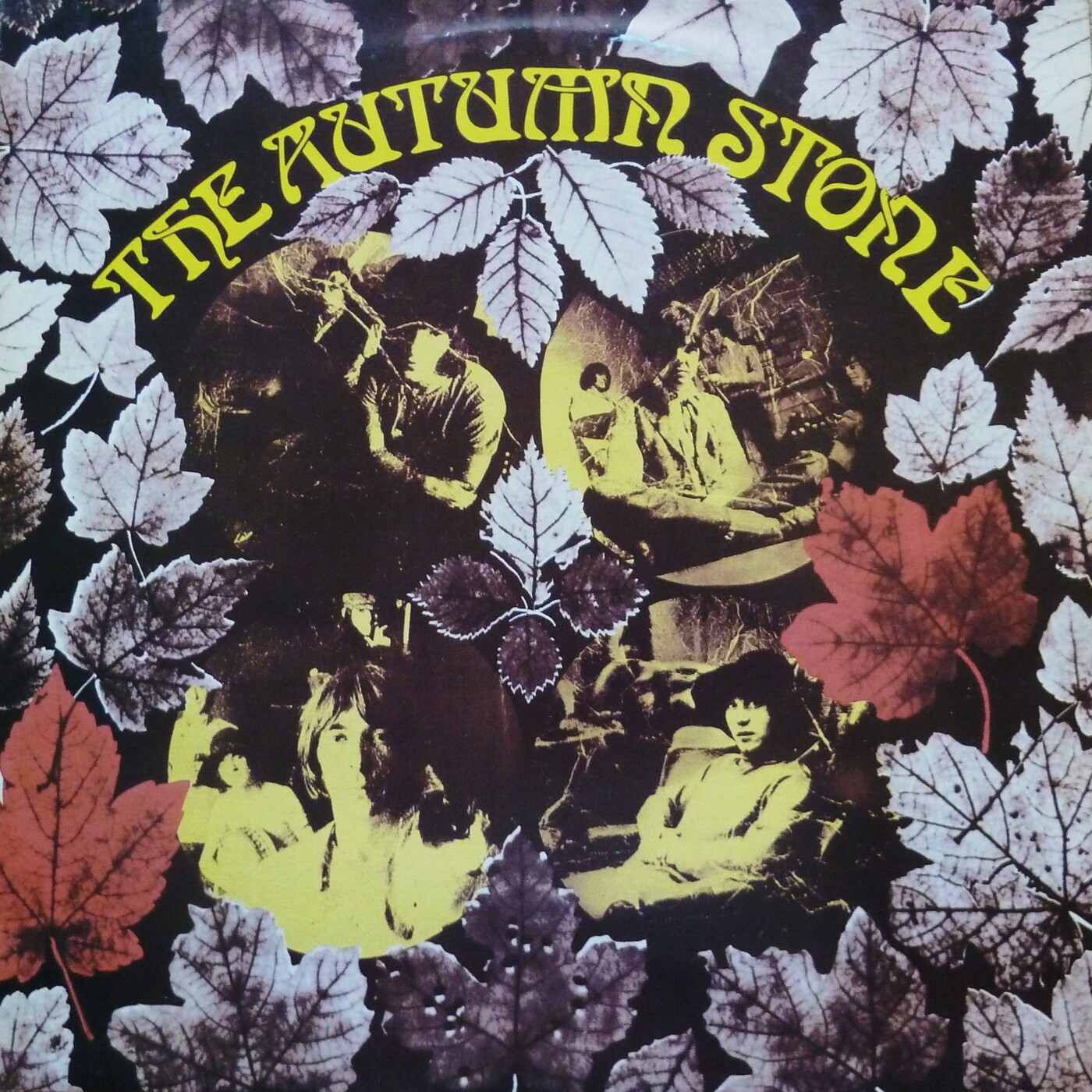
The Doobie Brothers, 1972, Al Stewart, 1969, The Small Faces, 1969
Considering the era where Böcklin became culturally impactful, a case could be made that it isn’t much of an Art Nouveau typeface at all, but a Sixties/Seventies typeface. It was used so heavily that the ultimate ‘70s zeitgeist retrospective chose Böcklin for its main title.

Arnold’s decay.
Not long after the transition from metal type to phototype, font technology made another big leap — this time, to screens.
As computers (and more importantly, displays) improved, type designers had another gold rush to bridge the gap between old fonts and new technology. Arnold Böcklin, now ubiquitous, got digitized, released, acquired, re-digitized and re-released. Then, nothing. Several versions of Arnold Böcklin (or “Boeklin”) are available today in the forsaken caverns of Myfonts and Adobe Fonts, digitized decades ago by URW, Linotype and Mecanorma), and dozens more iterations of opaque origins can be found on DaFont and its many clones.

The Mecanorma version available on Adobe Fonts. Nice outlines, idiot.
All digitizations range from bad to terrible. Böcklin wasn’t the prettiest typeface when it was first released in 1904: it contains much that I consider amateurish, but there’s also charm in the imperfections of metal type, and in an honest design from an unknown artist, from a social environment very different to ours.
The contemporary digitizations lack even that charm and honesty, leaving an empty husk.
Arnold Reincarnates.
A brief sidetrack. Around age 11, I developed an interest in architecture which quickly turned into an obsession with Art Nouveau, which I still suffer from today.
Arnold Böcklin, utterly Art Nouveau and prevalent everywhere, was therefore one of the very first fonts that I truly noticed. I remember trying to replicate the letters with a ballpoint pen, using a branded hotel napkin as exemplar.
Still, the idea of a revival didn’t arrive until 19 years later, well into my career as a type designer. Maybe because of its ubiquity, Böcklin had become invisible to me. Having developed a sharper eye for inconsistent weight distribution, when I did notice Böcklin somewhere, I didn’t even like it anymore.
Then one day in the summer of 2025, it dawned on me out of the blue: Böcklin is clearly beloved, and there is no good version of it anywhere. I had already built a modest reputation for Art Nouveau-inspired fonts and lettering, why not revive its paragon? That same day, I started work on my own version: Arny.
To stay true to the source, I primarily referenced the original metal-type Böcklin, as produced by Otto Weisert and printed by Petzendorfer, rather than interpreting an interpretation. All the same: the original font has some serious issues that I needed to address.
Contrast
Böcklin has a rather chaotic contrast model — the system that informs where the strokes of letters are thick and where they are thin. Take the lowercase “n”: it looks pretty standard, heavy in its vertical strokes, with some thinning out in the joint. Now look at the “o”: all its weight in the bottom of the bowl, heavier even than the heaviest part of the “n”, while the top is much lighter. These two letters might just as well come from completely different fonts.