Stride
Logo Design

Branding agency Redscout was in the middle of a rebranding project for Stride, a health insurance marketplace aimed at independent contractors. Stride’s previous brand already used a script logo, but its execution was lacking. I was called along to fix that. Under close communication with the team at Redscout, I developed a wide range of directions for the wordmark, from groovy scripts to geometric sans serifs.
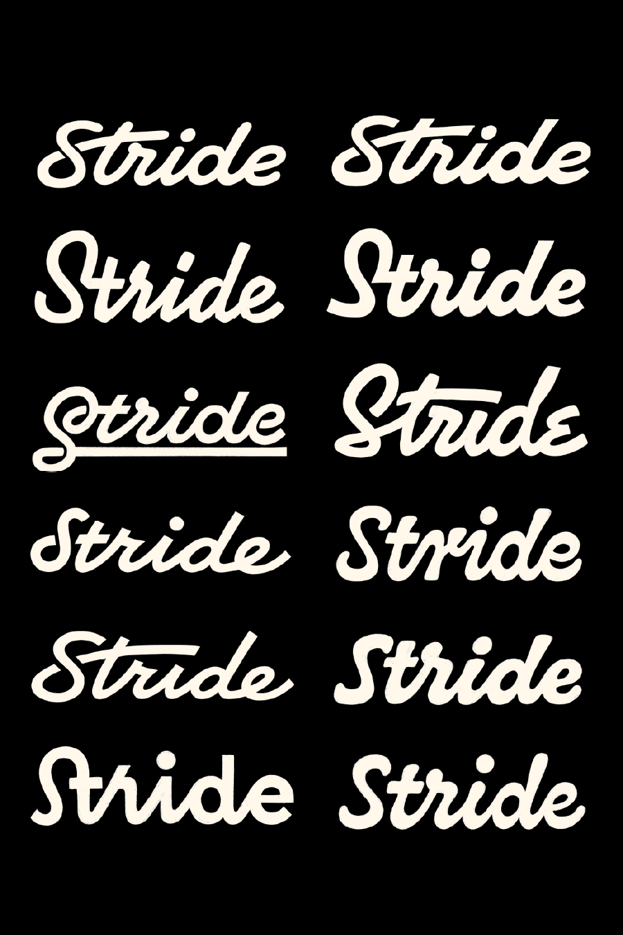


The perfect solution, as it turned out, sat somewhere in between. The new script logo feels energetic, contemporary and reliable. We achieved this in part through a monoline structure, making the strokes of the letters appear to be of uniform width. I say “appear”, because letters are never that easy; many optical corrections were necessary to make the logo feel right. In addition, I developed an alternate version of the script mark for usage at smaller sizes, where the primary version may lose some of its crispness.


Stride’s rebrand received a feature in BrandNew, where reviewer Danica Mitchell wrote the following about the wordmark:
“The new logo, drawn by Herzberg Design Co, remedies [the old logo’s] most offensive flaws with a much more practical, classic cursive "r" that resolves the awkward break in the middle of the mark, a monoline stroke that makes that mark feel like a considered piece of lettering rather than a hastily live-traced signature, and a recalibrating of the "S" that necessarily drops the baseline and balances out what was previously dead space.”


Looking for the perfect logo for your brand? Let's talk.