On Bonkus
In the 1920’s, the bauhaus movement experimented with stripping letters down to bare geometric forms. In doing so, they produced a few classic sans serifs such as Futura. Most, however, were too odd to achieve timelessness—among these Herbert Bayer’s Universal.
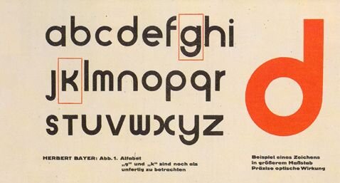
Universal
In the late sixties, Art Deco and modernism made a comeback. Geometric bauhaus typefaces were reinterpreted, or simply copied, and became quite popular alongside quintessential ‘organic’ fonts of the time such as Cooper Black (also a 1920’s revival, coincidentally).
Notable examples include David L. Burke’s Burko, Robert Trogman’s Blippo, Herb Lubalin’s Ronda, and ITC Bauhaus, among many others. I will refer to this collection of alike typefaces from here on as “Roundos”.
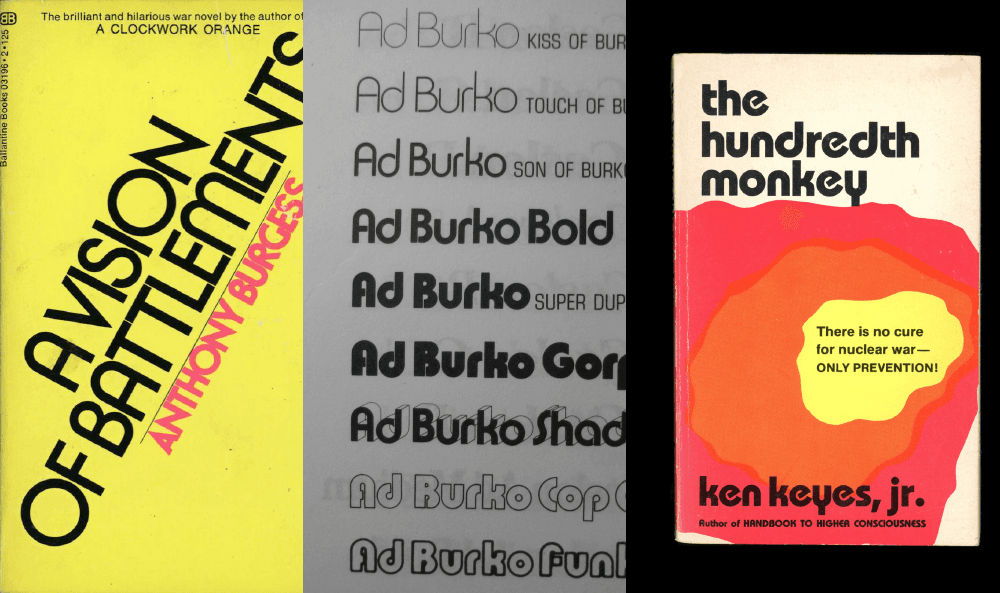
From Left to Right: Ronda, Burko, ITC Bauhaus
Fast forward fifty years, a realtor named Shane Thornton asks me to work on his branding. Shane is looking for an identity that’s clean and professional, but has a touch of sixties/seventies California. A natural option seems a neat-yet-funky sans serif: a Roundo.
Some googling later, however, I can’t find a specific font that quite possesses the combination of characteristics I am looking for. What’s more, the existing options are pretty lackluster in quality and versatility—most have only a regular and bold. These fonts may have originally been designed by pros, but their digitizations leave to be desired, and I curse at their poorly executed bezier curves and computer generated obliques.
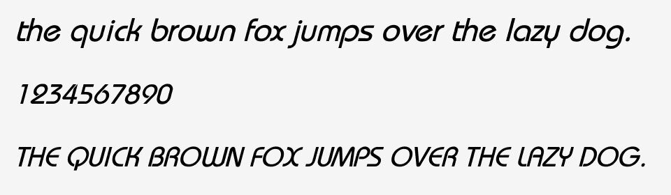
An abhorrent version of Bauhaus Italic. Please keep it in your thoughts & prayers.
That’s why it’s nice to know how to draw type. I fire up FontLab and get to work on my own version, which looks exactly how I want it to. Although Roundos primarily use an arched geometric version of /A, /N, /M, /W, /Y and /w, I found that more Futura-like diagonal versions of these letters turned the font more robust—a welcome attribute.
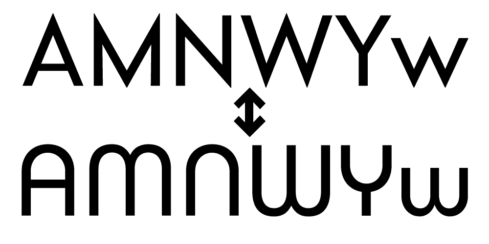
Sharp vs Round caps (the published version of Bonkus has both, but the sharp caps are default).
Another issue that Roundos tend to face is that due to their strict adherence to geometry, they do not taper joints, leaving overly dense areas where arms meet stems. Blippo and Bauhaus solve this issue by simply not joining strokes, leaving a small gap of negative space. Another typeface, Churchward Design 70, uses sharp inktraps to prevent overly dense areas. I find this solution pleasing, because it remains strictly geometric: a triangle cutout.

Ronda’s refusal to taper joints causes relatively dense spots.
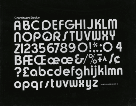
Churchward Design 70 introduces the triangular inktrap to prevent overly dense areas.
Churward Design 70’s inktraps, however, are very deep and narrow. This looks good at huge sizes, but quickly becomes eye dirt when smaller. My inktraps are more versatile: wider and shallower, they bring negative space where needed without hindering scalability.
In the meanwhile, Shane runs into trouble with his broker because of his rather expressive new personal branding, which doesn’t fit company policy. Alas, I’m far enough into the project to continue the typeface I started on his behalf.
After completing the basics of the regular, I set out to a bold and thin weight. Bonkus, as I have dubbed the project, is to be fully variable, so each glyph is designed with care to have matching anchor points. Upon completing all weight masters, I add an oblique axis, wildly underestimating how much time will go into its completion. This is by far the most labor intensive task. The computer can automatically slant letters to a certain angle, but it will look disjointed and ugly, particularly on round shapes. Each individual glyph has to be optically adjusted, a task that is mindnumbing and harsh on the wrists. It takes me two months of on-again, off-again grinding. I start four new typefaces during this time, merely to feed on the creative energy that comes along with the early stages of a new project.
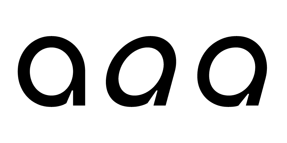
An a: Roman, auto-slanted by the computer, and optically adjusted by hand.
But I do it. And now that I’ve put this much effort into it, I decide I might as well take it all the way home. So I add every diacritic under the sun, a ton of weird ligatures, useful and less useful opentype features, alternates, you name it. I even figure out how to design Cyrillic script, and ask native Cyrillic readers to critique it on the internet. I set spacings, and oh! The kerning! It never ceases!
But after all the tedious bug-testing is done, and every conceivable kerning pair in the world has been kerned, few things could hope to feel as satisfying as hitting “export font” one more time, neatly putting her in a zip file, and throwing it out into the world.
And so, today, I bring you: Bonkus. A contemporary take on a classic, and my most labor intensive project to date. I hope that somebody finds it useful.
Special thanks to Shane Thornton for getting me started, to FontsInUse.com for the countless inspirational specimens, to La Bolde Vita type foundry for the information to get started on Cyrillic script, and to the users of TypeDrawers.com for their ever pertinent feedback.