On Fang
New York City, December 2021. Katie and I are visiting her family on the east coast. We have just spent New Year's Eve watching a Christine Martucci concert at the Stone Pony in Asbury Park, foolishly assuming that our vaccines would be able to withstand the Delta variant.
Mine did not.
And so I found myself quarantined in the guest room with a macbook and plenty of time on my hands. That’s how Fang started.
Thankfully, when you quarantine in Brooklyn, you at least get to have tasty Italian food delivered to you.
While many of my typefaces start out with a clear concept, Fang wasn’t so obvious.
I had recently come to learn of the work of Lucas Sharp, who does a fantastic job at giving a contemporary twist to hand-drawn letters from decades and centuries past (Ogg being a now famous example of his skill). I also enjoy the foundry’s generalist approach, which allows both workhorse families and one-or-two style display typefaces.
In my own practice, while I started with a few one-style fonts, I felt a need to publish bigger families with many styles: ranges of weight, width, slant that allowed one typeface to have dozens of sub-styles. This is partially a practical motivation: larger type families are more useful to users, and they are also worth more money. But looking back, I can see that a part of making larger type families was wanting to be “one of the big boys”. All the foundries I look up to are publishing 200-style superfamilies, I need to do that too! And so, seeing how a powerhouse like SharpType casually releases one or two-style typefaces like Respira Black or Salter was a breath of fresh air. Not everything I released had to be a ginormous multi-master construct of interpolation and variability!

Respira Black. So friggin’ good, aaaaaaaaargh!
Simultaneously, I was impressed with the elegance in SharpType’s oeuvre. Much of my own type library consists of typefaces that would, on first glance, be described as “funky” more so than “beautiful”. That is fine, of course, but funkiness can grow tiring. I wanted to make something smooth and elegant, that could be used in a hip magazine or on the façade of a neoclassical building.
So maybe that’s how Fang really started: a desire to make something pretty, but with relatively little pressure for it to “turn into a whole big thing”.
Broad nib calligraphy has often been a foundation of my work, and Fang is no exception. As I started on the Roman lowercase, I imagined a well-maintained broad brush writing the strokes, allowing them to come to crisp, hyper-thin endings.
When writing letters with a brush, the thin strokes in letters like the A and E are often a bit thicker than the stroke endings—this is partially purposeful, so that thin strokes don’t disappear at smaller sizes, but also just the nature of the instrument. This can be clearly observed when comparing Roman square capital engravings (which were first written with a brush before being carved into stone) with mechanically drawn letters like those of Bodoni. In the latter, the thin strokes of a letter like A or E are just as thin as the serifs.
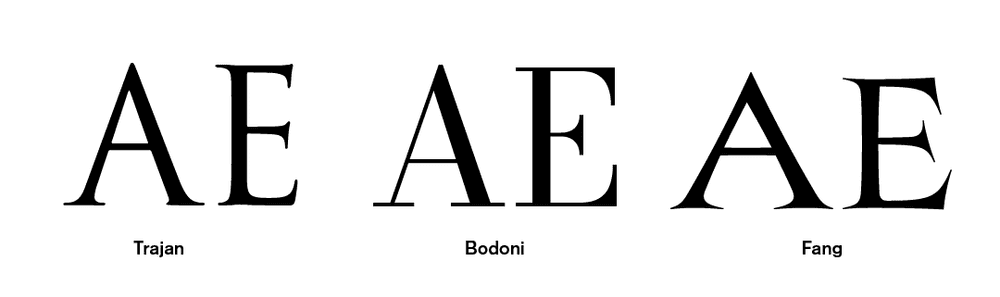
Comparison of weight distribution between classic Roman Square Capitals, the rationalized serif font Bodoni, and Fang.
Leaning into this “3-way contrast” of thick strokes, thin strokes, and even thinner stroke endings, felt like a good first rule to establish. That said, I didn’t always want to be bound to what is calligraphically possible, and still allowed myself some leeway in order to produce the most elegant form of any letter.
For instance, the T is symmetrical, which wouldn’t be the case in a true written letter, but I thought it looked nicer this way.
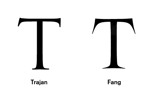
A calligraphic T (asymmetrical) vs a mechanically drawn T (symmetrical)
Another parameter in Fang is the implied rotation of the pen, which dictates the underlying logic.
In calligraphy, rotation of the pen nib can be used to great effect to have more control over the weight distribution of strokes, allowing for flaring and precisely adjusted terminal angles.
A great example of brush rotation in action can be seen in this video by master calligrapher John Stevens. Note how the diagonal of the N starts with the brush placed vertically. It quickly moves to an angle of roughly 50 degrees, before going back to vertical. Besides a neatly pointed apex and vertex, this lends a beautiful concave form to the stroke, an aspect I tried to capture in Fang.
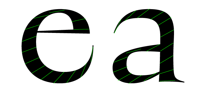
The implied angle of the brush throughout the e and a in Fang.
The forms of Fang are drawn from various sources. Proportions of the uppercase reference, but do not adhere to, classic Roman capitals. Letters like E and F are modernized by making them less narrow, whereas other letters like A and V are made unusually wide—a stylistic choice that I pulled from 16th–17th century Dutch architectural lettering.
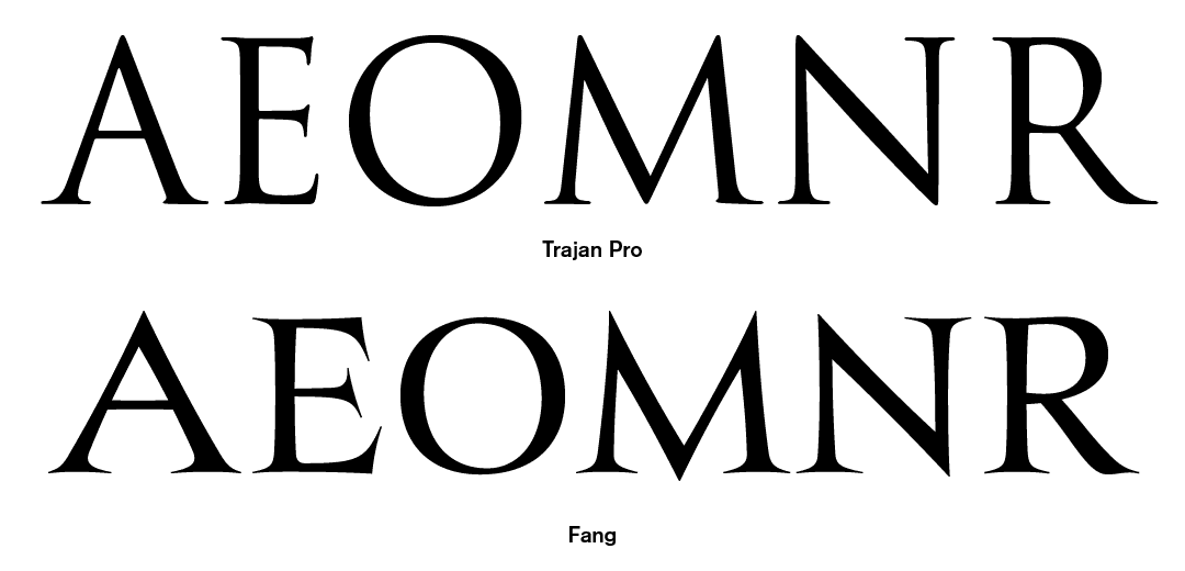
Fang’s proportions draw from the classical Roman model, but do not adhere to them.
The lowercase, as it refers to humanist calligraphy, takes quite a few pointers from Edward Johnston’s foundational hand, as can clearly be seen in letters like a and g, but also from French Renaissance printing faces like those of Claude Garramond and Jean Jannon (retronymously named Oldstyle serifs).
To pay extra ode to the latter, I added a few classic Oldstyle fixtures such as a ring-shaped zero and a Roman-style one as alternates, as well as plenty of fleurons, a manicule, and other such 16th century bangers.
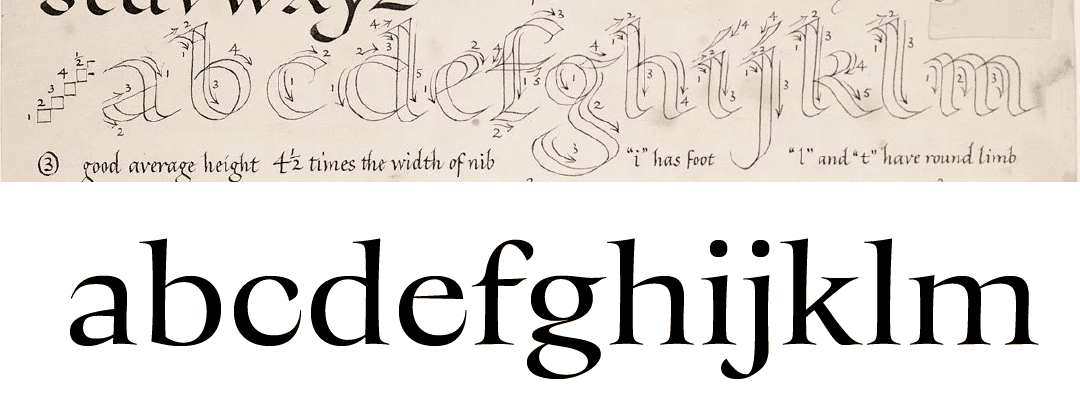
A comparison between foundational hand (specimen by Irene Wellington) and Fang’s lowercase.
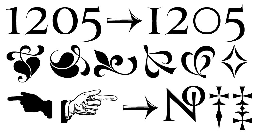
The alternate figures + ornaments and symbols.
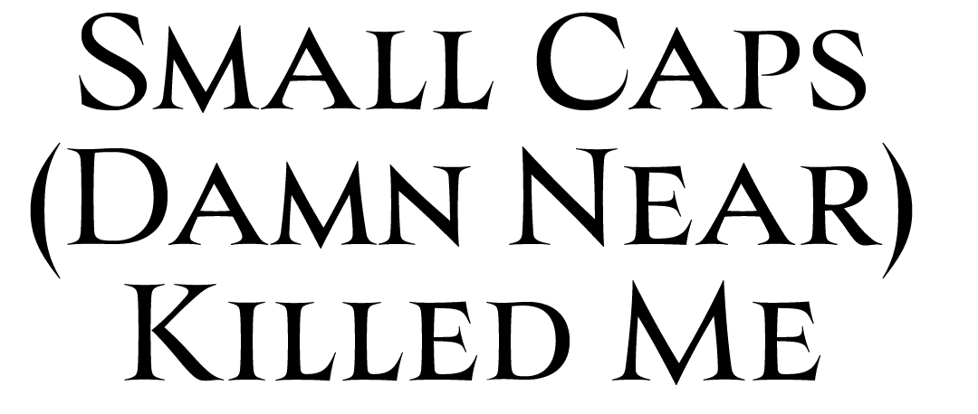
Fang also marked my first time drawing small caps, which made me question all my aspirations as a type designer. It involves little creativity, but does require a lot of tedious nudging in order to make slightly smaller versions of caps that look even in weight compared to their full-sized relatives. I pushed through it, aided by the knowledge that I was making only two styles. How people draw 16-master typefaces with small caps is beyond me.
Fang’s initial drawings *really* accentuated the sharp strokes, but I toned this down a little at the advice of Tony DiSpigna who, upon seeing the first draft, called Fang “Amateurish”.
The typeface’s organic and precise nature also made it quite tricky to get the curves 100% right, and small revisions kept getting made to the letterforms until the very last day before release. These changes combined were profound enough for Tony to withdraw his prior statement, even commenting that Fang may be one of my best typefaces yet.
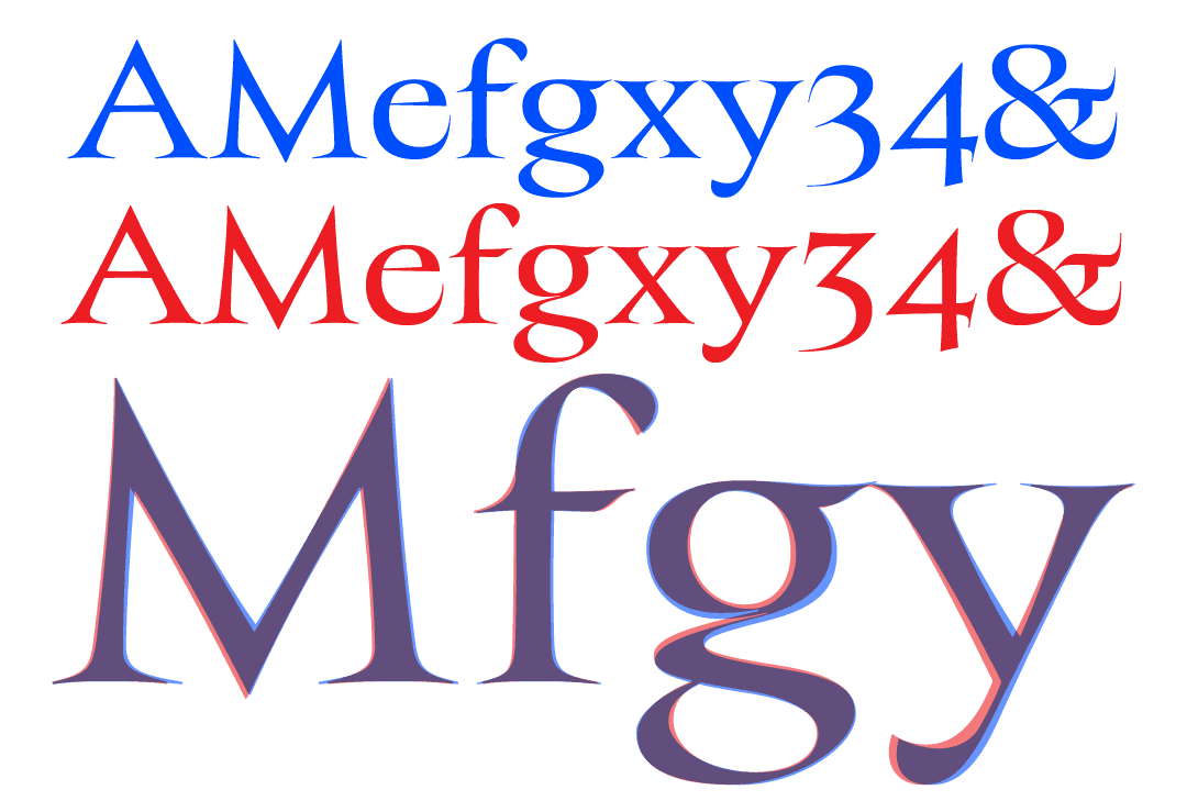
An older cut of Fang (blue) and the release cut (red). Below, the two overlaid, to show the small but significant changes.
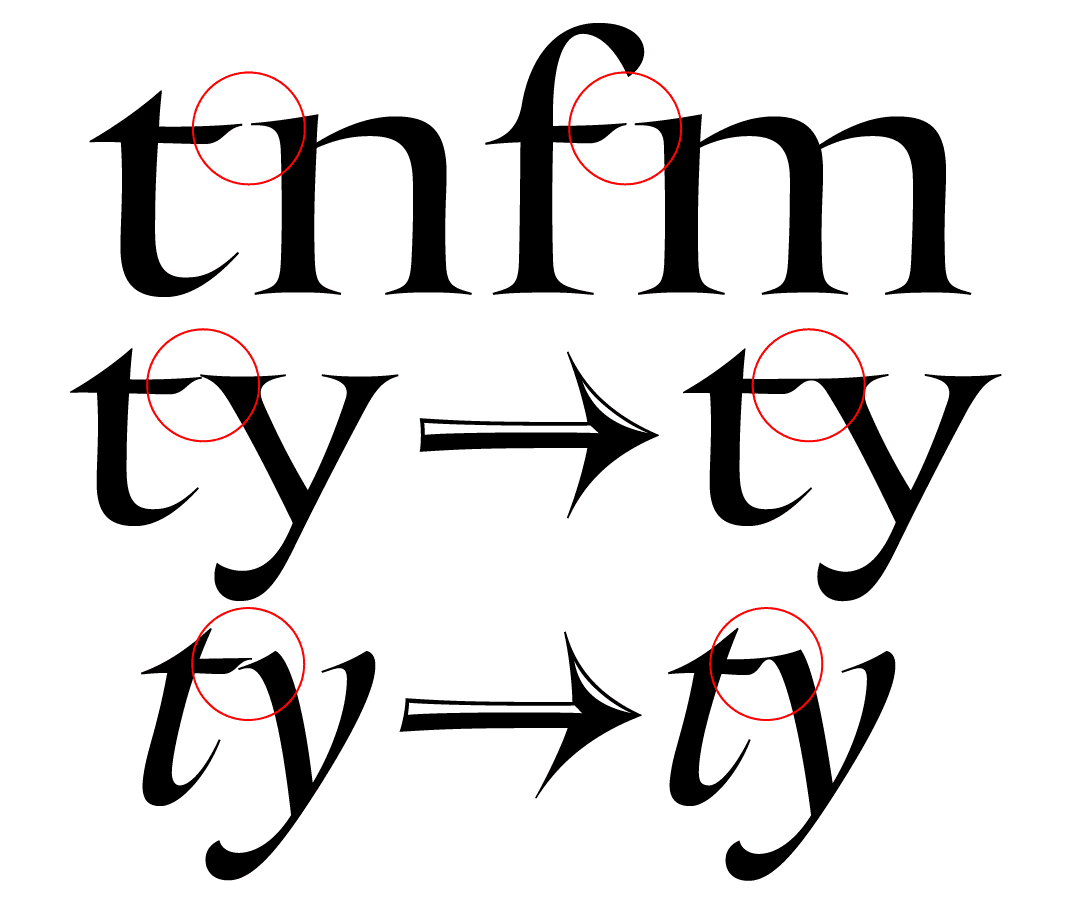
I tried hard to make Fang as beautiful as possible in small, subtle ways. Stroke endings and serifs line up neatly, such as the crossbar of the t to the entry serif of letters like the n. Where this match-up was impossible, such as in the t-y pairing, I added ligatures.
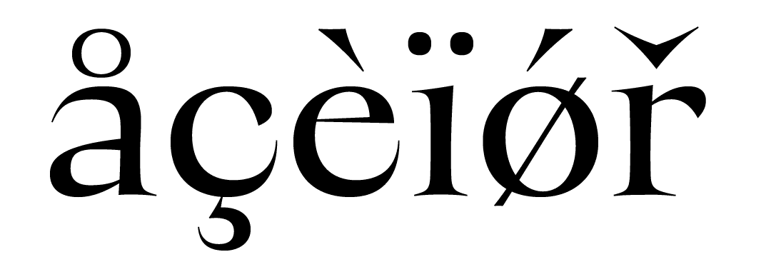
Another aspect of Fang that I am quite proud of is its diacritics. I opted for somewhat traditional-yet-elegant accents, on the larger end. Throughout my (admittedly short) career in type, it has taken me some time to really understand how these marks ought to be shaped, sized, and placed, but I think the many attempts I’ve made at drawing them over the past few years have paid off in Fang. Come on, just look at that cedilla.
The æ and þ in the italic turned out to be particularly challenging, both for different reasons.
The italic uses a single story a, as is tradition, instead of a double story a as found in the Roman. In turn, this makes æ look dangerously close to œ. There are many solutions to this, but none as graceful as Bram de Does’ Lexicon, after which I modeled Fang’s æ.

œ and æ in Fang Roman and Italic, and those drawn by Bram de Does for Lexicon
The þ was tricky for a different reason. This letter is normally formed by fusing b and p, which is straightforward enough. However, Fang’s italic b and p are different in form, and I was not sure which ought to be used as a base—after all, I am not Icelandic. Consulting some classics, unfortunately, provided no clear answer.
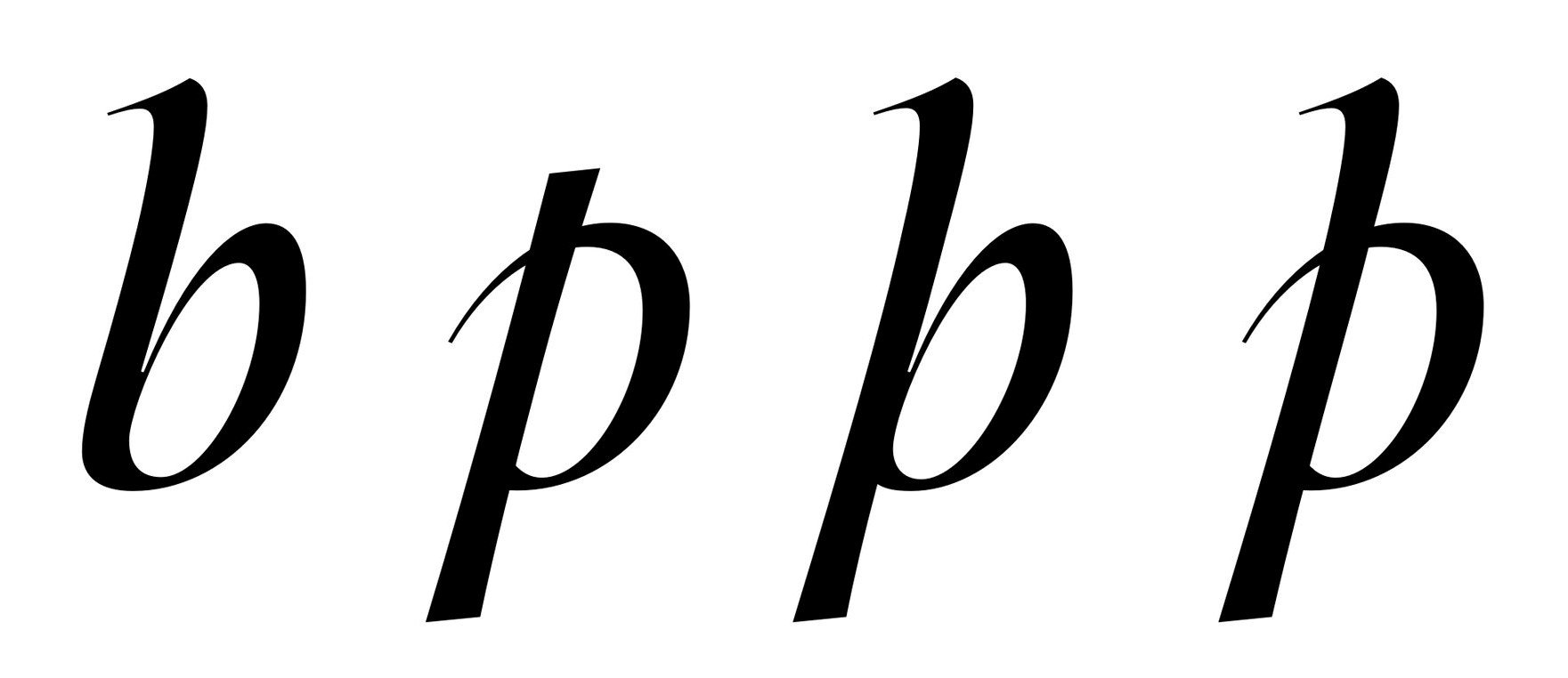
The options: a b-based thorn, or a p-based thorn?
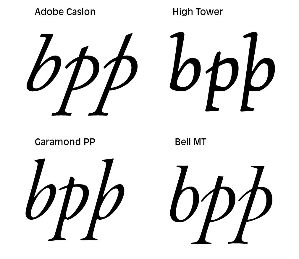
The precedent: all over the place.
I took it to twitter, and also consulted an Icelandic designer, with the consensus being that even though p is the more common basis for þ, in this case the b-based þ was preferable. With full access to the internet, type designers truly have no excuse to half-ass characters they aren’t familiar with.
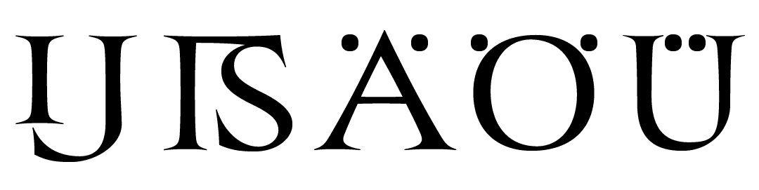
Some final touches to the language support came through extra care and attention to a tasteful IJ digraph, a somewhat unusual uppercase ẞ, and alternate tucked-in umlauts for the uppercase, a feature I’ve been wanting to add ever since I started following Berlin Typography.
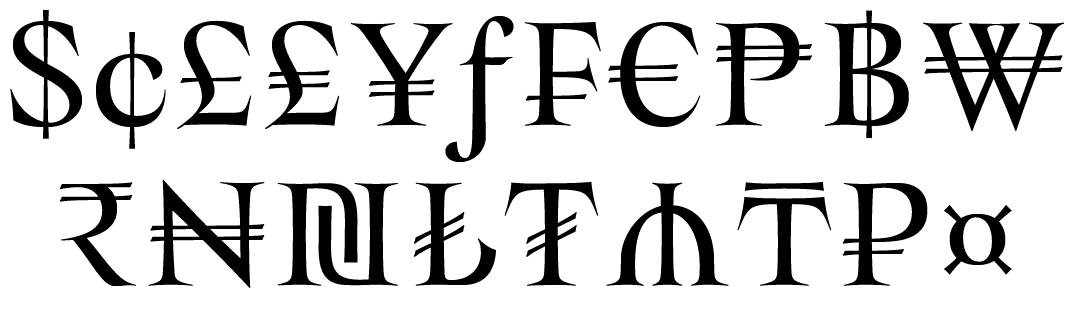
I also used Fang as an opportunity to expand my knowledge of currency symbols, and how to properly draw them. It strikes me as odd that the standard currency symbols in any typeface are the dollar, euro, yen, pound, florin and peseta, when the latter two are not even in use anymore. Meanwhile, many other currencies such as the Rupee are used on a daily basis by hundreds of millions, but relatively rarely included in typefaces. While I didn’t manage to cover every single currency, I got quite a few. The Israeli Shekel, the Azerbaijani Manat, and the Turkish Lira were particularly challenging as their forms aren’t as simple as adding a horizontal or vertical bar to an existing letter.
In The Gay Science, Frederich Nietzsche writes: “Masters of the first rank are revealed by the fact that in great as well as small matters they know how to end perfectly, whether it is a matter of ending a melody or a thought, or the fifth act of a tragedy or of an action of state. The best of the second rank always become restless as the end approaches and do not manage to slope into the sea in such proud and calm harmony as, for example, the mountains at Portofino—where the bay of Genoa ends its melody”
I am no master of the first rank, but I did my best to end Fang’s production gracefully. After all the essentials are done—fractions, figures, ordinals, ornaments, and so forth, it is easy to find yourself so sucked into the process that you start looking for more things to add. With Fang, I got incredibly tempted to start adding uppercase ligatures. I’ve been noticing a trend of these being used in editorial design, and in my eagerness started hacking away at these too. But I realized that this was a detour; a distraction. Cap to cap ligatures are unusual, often distracting, and simply not very elegant. I realized I had to let Fang’s capitals stand proudly by themselves, like the mountains at Portofino or something.
One final question: why the name, “Fang”? It came to me as I was hacking away at enemies in the fantasy game Elden Ring with a badass greatsword named “Bloodhound’s Fang”. A quick google search left me amazed that nobody had yet taken a name that good (available font names grow scarcer by the day), and I pounced on it without hesitation.
Moral of the story: even a two-style font can take you forever, and you have to set realistic limits to the scope of your projects: for the sake of your own sanity, but more importantly, because it will make your work better.
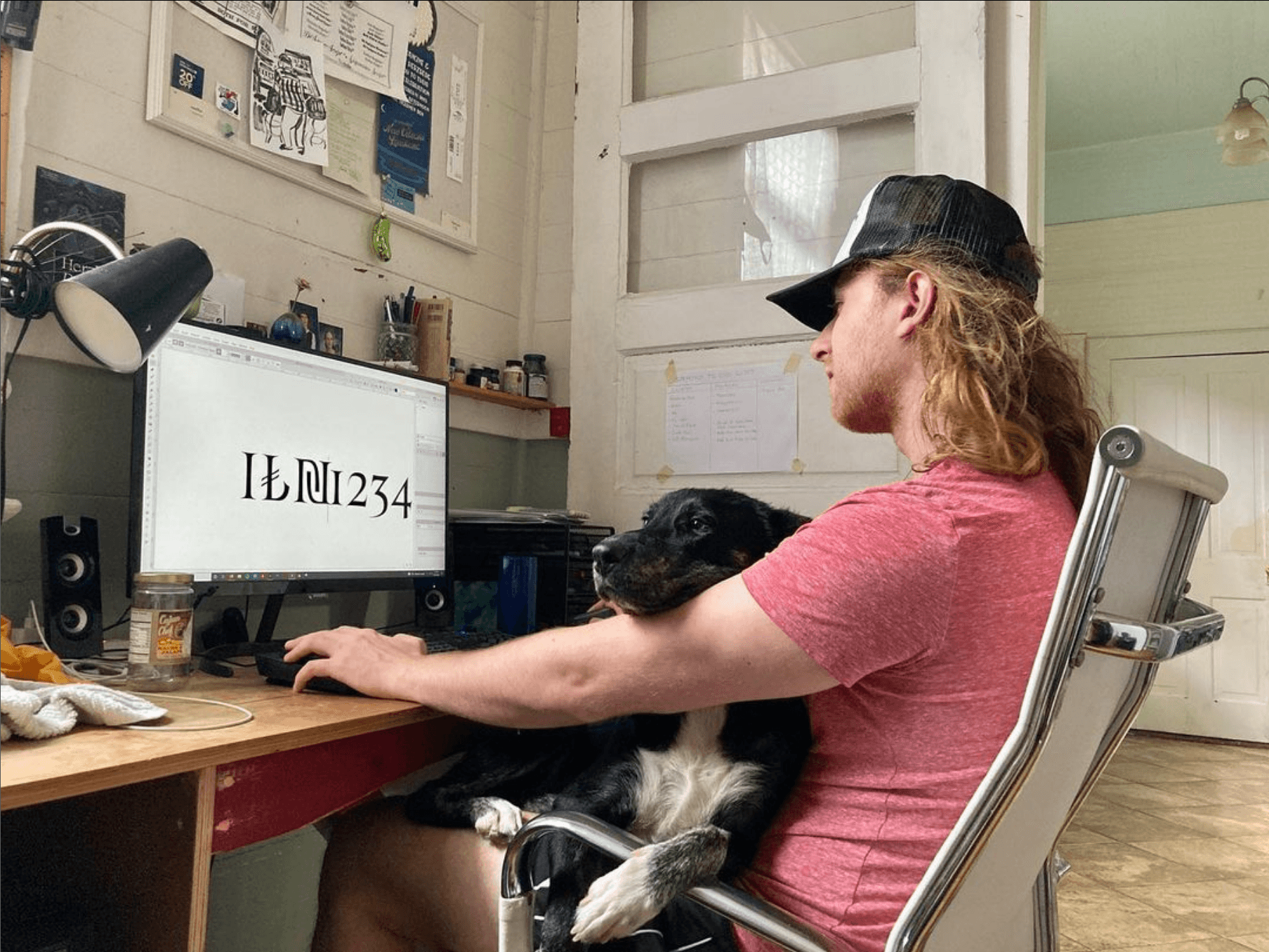
Moral support while drawing in my messy, not very instagrammable office.