On Thanatos
Thanatos’ conception came through a commission by filmmaker and director Alex Fofonoff, who was getting close to finishing his short horror film, ”While Mortals Sleep”.
The movie is inspired by the likes of John Carpenter, and entirely shot on super 16mm film. Throughout its 10-minute runtime, it sets an unnerving vibe that ends in an otherworldly climax (like making love to a vampire).
After watching an early cut, I sketched out four potential styles that attempted to match the atmosphere that Alex had created.
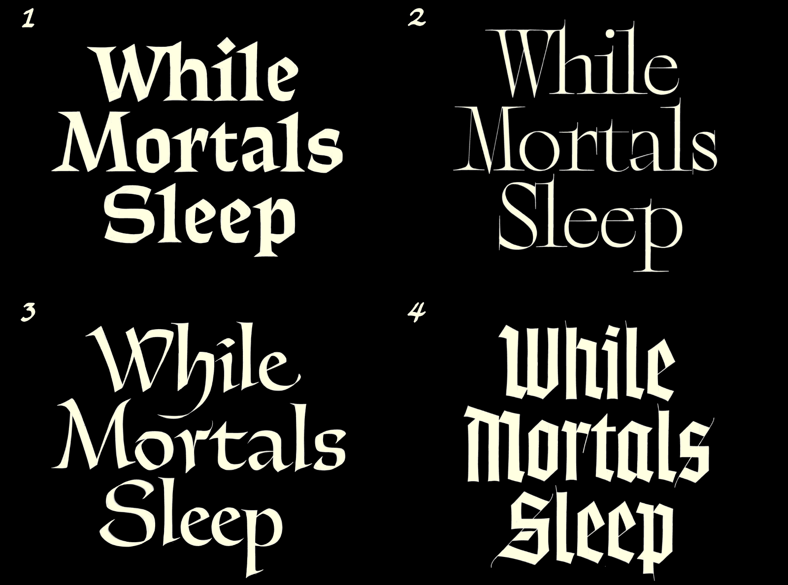
1: What is to become Thanatos 2: Maybe a bit too “Adams Family” 3: Helmut Salden knockoff 4: Blackletter—I can’t help proposing it on every project I get.
Alex was drawn most to option 1. Not too heavy-handed, but not particularly subtle either; legible, and matching of the ‘70s/‘80s throwbacks. I had secretly been rooting for option 3, based on some calligraphy by all-time great Helmut Salden, but concurred that it was no match for option 1. We did attempt a version with Lombardic capitals, but this skewed a bit too far towards fantasy and Medievalism to be a good fit.
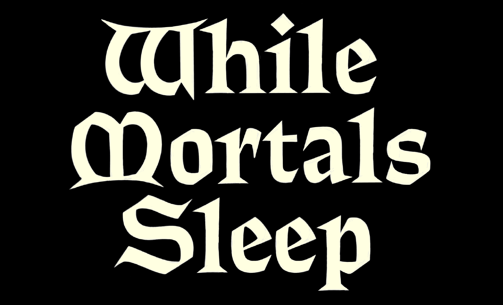
I won’t lie: these caps are pretty cool. I had kinda forgotten about them until writing this, but now I want to add them to Thanatos as alternates…
I had drawn this prototype (no pun intended) with my eyes on Albertus, John Carpenter’s signature credit font, which he uses throughout his entire filmography.
Albertus was designed between 1932 and 1940 by Berthold Wolpe, a Jewish German artist and craftsman with a background in metal engraving. This is often cited as the reason for Albertus’ unique look, which features neatly cut terminals, short glyptic serifs, and very low contrast—all applied to a classically proportioned uppercase and calligraphically informed lowercase (if you aren’t sure what all that means, I envy you).
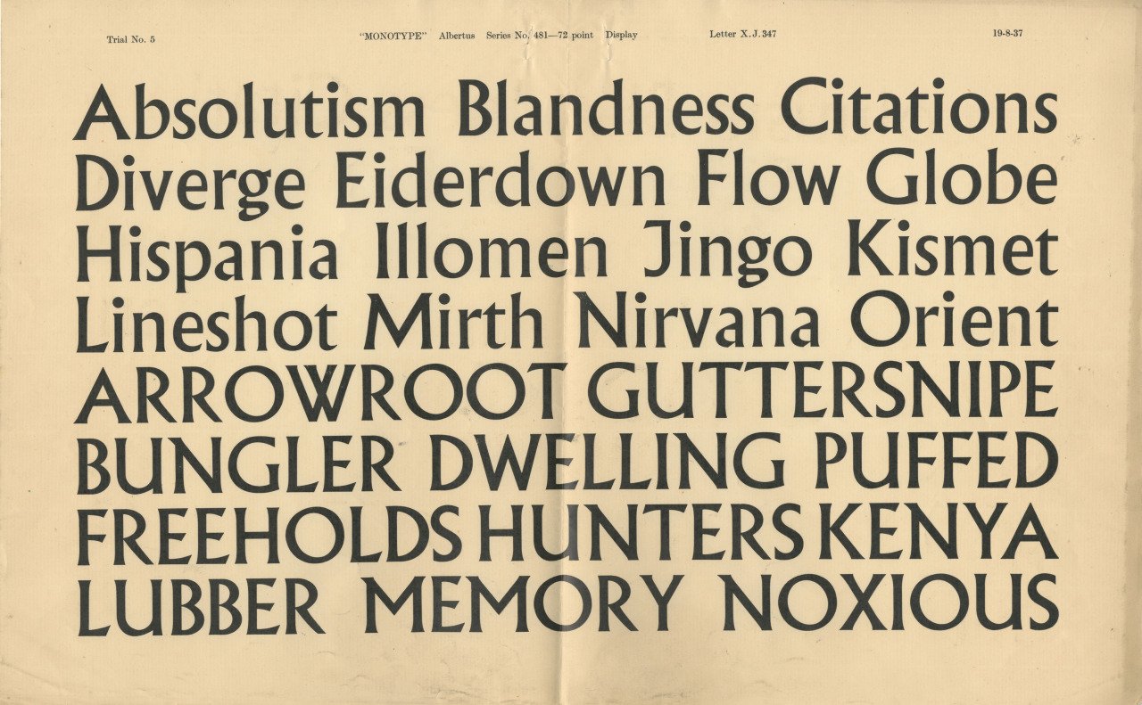
Trial showing of Albertus, ~1940. Image courtesy of Dan Rhatigan. Through Daily Type Specimen Tumblr.
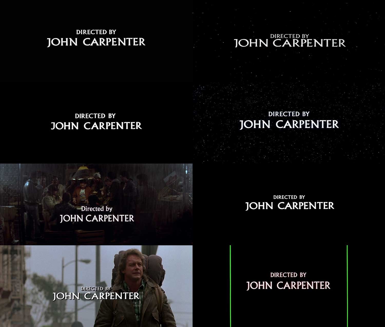
A compilation of John Carpenter’s love for Albertus. Source (and article on the subject): FontsInUse.
Where Albertus was influenced by metal engraving, I took a look at letters engraved into wood instead. Wood is a material close to my heart (as I’ve written about in the past) and I’ve toyed with wood carving. Despite never getting particularly good at that, I found that the rough nature of wood is best adapted by letters sturdy in form, with low contrast and sharp, angular shapes. This isn’t to say that master carvers can’t get beautifully delicate—but I couldn’t.

Classic wood carved letters: simple, robust, slightly concave. Source: Lettering Arts Trust UK.
For my concept, I borrowed the low contrast of Albertus, but added woody sharpness through jagged and squared shapes, and of course, long thorny serifs. These helped push the horror-ness a little further, and also took the letterforms into its own unique direction, rather than just being an Albertus clone.
Although Albertus features low contrast in letters like the O, it also has razor thin stroke connections in some spots, like in the tail of the g or where the bowl of the n connects to its stem— a feature that Thanatos (as I had now dubbed my font) would inherit.
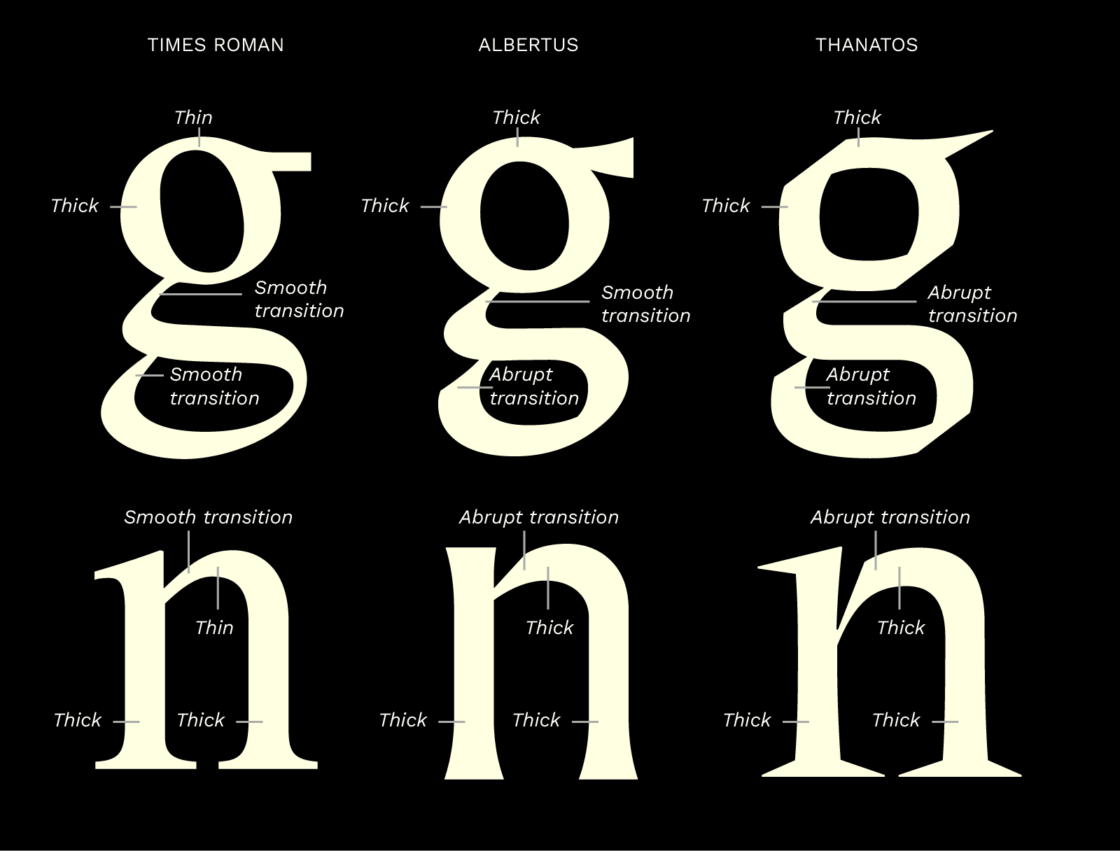
Contrast and structure comparison between Times Roman, Albertus, and Thanatos.
After whipping up a basic character set with a weight axis from thin to black, it became clear that Thanatos’ sharp details provided an issue when setting the text at smaller sizes. Rather than compromising the beautiful sharpness which worked so nicely at large scales, I added an optical sizing axis as well, bringing me to a 2-axis typeface with 4 sources (and doubling the work ahead).
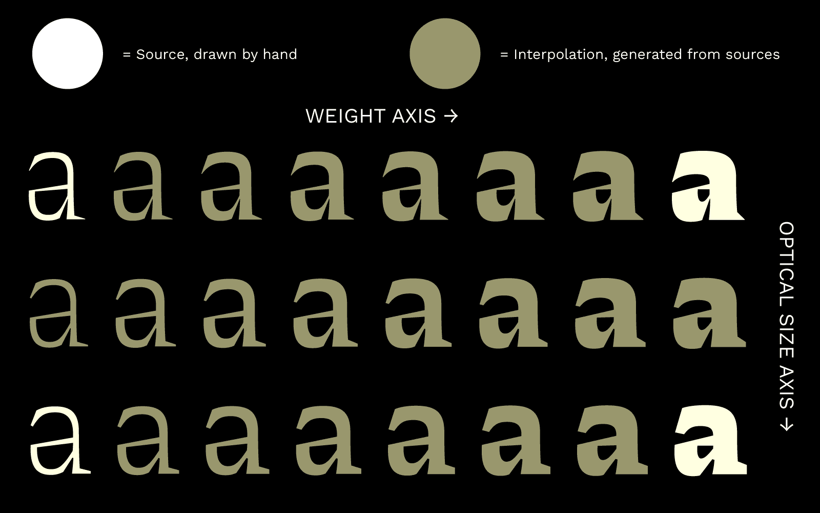
Each axis addition doubles the number of required sources. A 2-axis font requires 4 sources, a 3-axis font requires 8, a 4-axis font 16...
The optical sizing changes a few key characteristics that aid crispness and legibility at small sizes: thicker serifs (almost slabs), thicker thin strokes, more generous spacing, and wider forms in the thin weight. While the display’s thin weight is nearly a condensed form of the heavy, the text’s thin weight is more generous in width, which prevents it from getting muddled when set at 10 points or smaller.
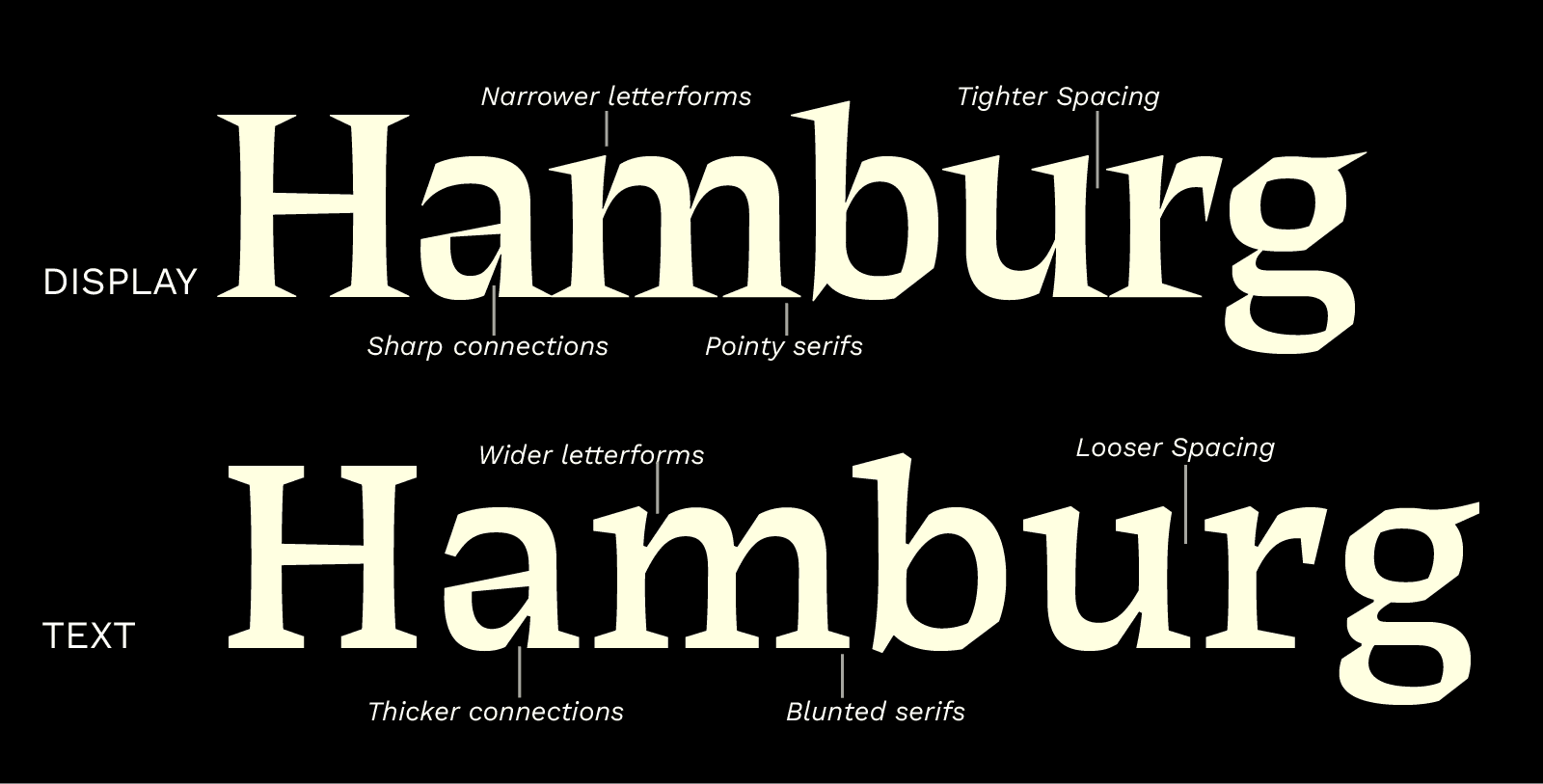
While I initially intended the “text” version of Thanatos to be little more than an adjustment of the display forms that wouldn’t fall apart when smaller than 36pt, I was surprised by how “texty” it really looked. While a little spicier than your average Times New Roman, the texture was pleasant and even, and really showed potential.
As such, it became clear to me that I needed to add features present in a proper text face: small caps, old style figures, fractions, but also…an italic.
That would have to wait though, as at this point Thanatos was ready to be used for its original purpose, in While Mortals Sleep’s credits and promo materials. Good thing, as the short film had been selected for the prestigious film festival Sundance, tightening the deadline.
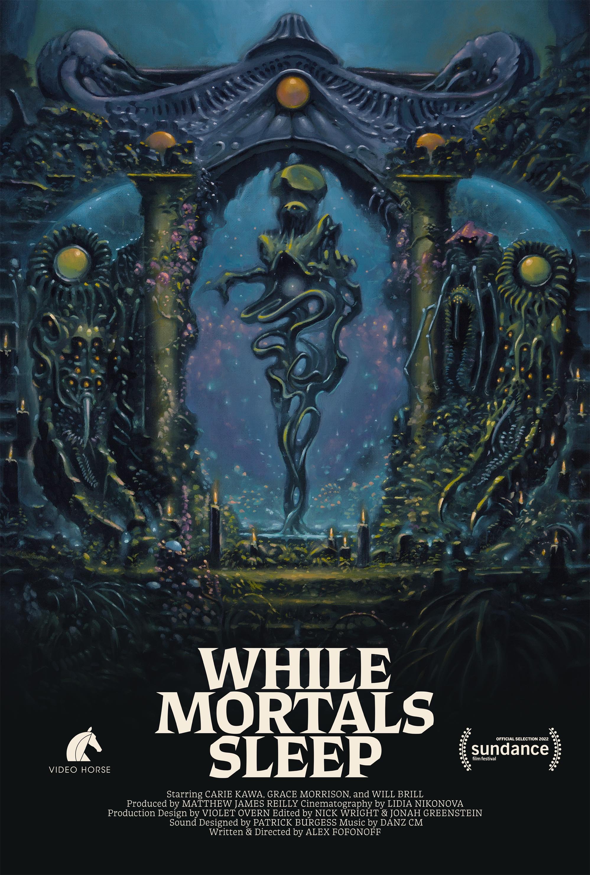
Poster for While Mortals Sleep using an earlier cut of Thanatos. Clear differences with the final version include the width of the M and the crossbars of A and H. Painting by Jesse Jacobi.
Progress on a retail release of Thanatos continued—back to the italic.
Due to the calligraphic nature of the Roman, a mere oblique with a hastily swapped single story “a” and “g” wasn’t going to cut it. The entire lowercase was redone, adhering to the nature of a written italic while still trying to match the clunky sharpness of the Roman. The result is possibly more unique than the Roman style ever was (and once again, doubled the work ahead of me).
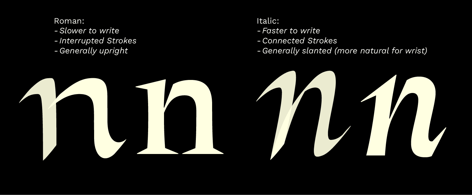
Comparison between the ductus of Roman and Italic letters.
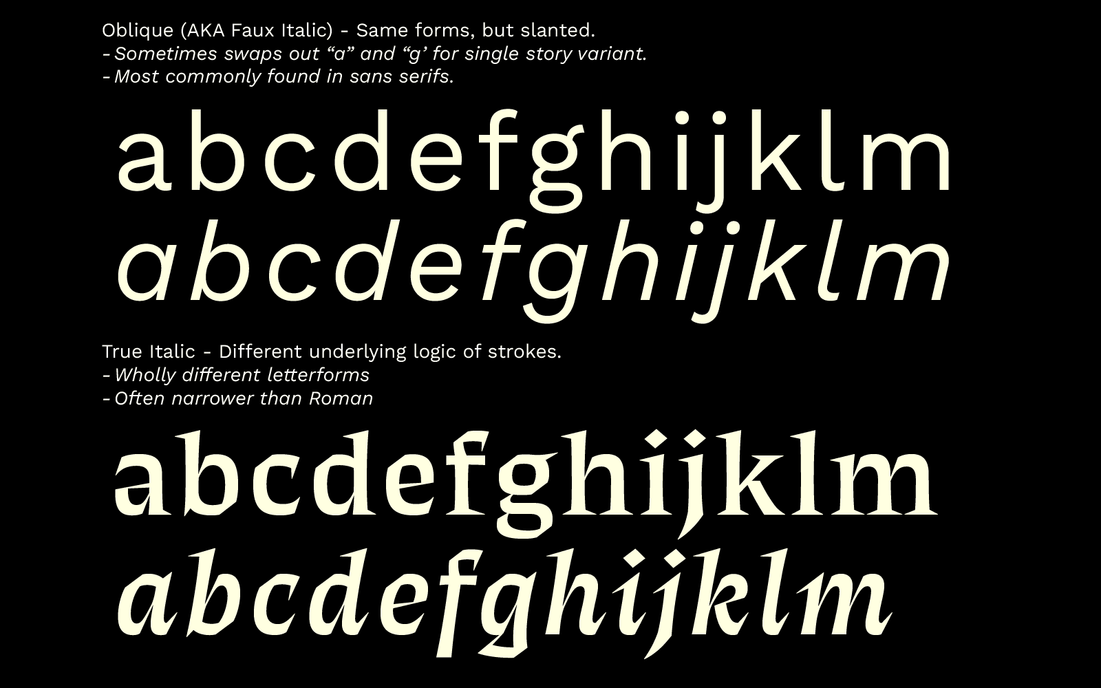
Comparison between obliques and true italics.
This was all working for me—Thanatos was becoming a weird typeface masquerading as a normal typeface. From a distance, perhaps just another serif, but upon closer inspection, something fresh. That’s the golden egg that any type designer looks for.
Plough horses
The design and manufacturing of Thanatos took a good bit over two years. Not that all that time was spent working—quite the opposite. I’d draw some punctuation marks or small caps, and then abandon the hard labors in favor of a shiny new typeface I’d just started, or a client project I needed to get done to pay my rent.
Type design is a slog. A job for plough horses, not race horses. I like to race, but I guess I do OK enough at plowing too. In my post about Fang, which I released just under a year ago, I asked how on earth type designers manage to add small caps to a 16-master typeface. And while Thanatos has “only” 8 masters, the answer I found was this: an unhealthy amount of coffee, and an even unhealthier amount of determination.
But the on-again, off-again method also has benefits—time away from something you’ve been staring at non-stop for dozens of hours can be very helpful in spotting mistakes, or recognizing that certain decisions may not make much sense.
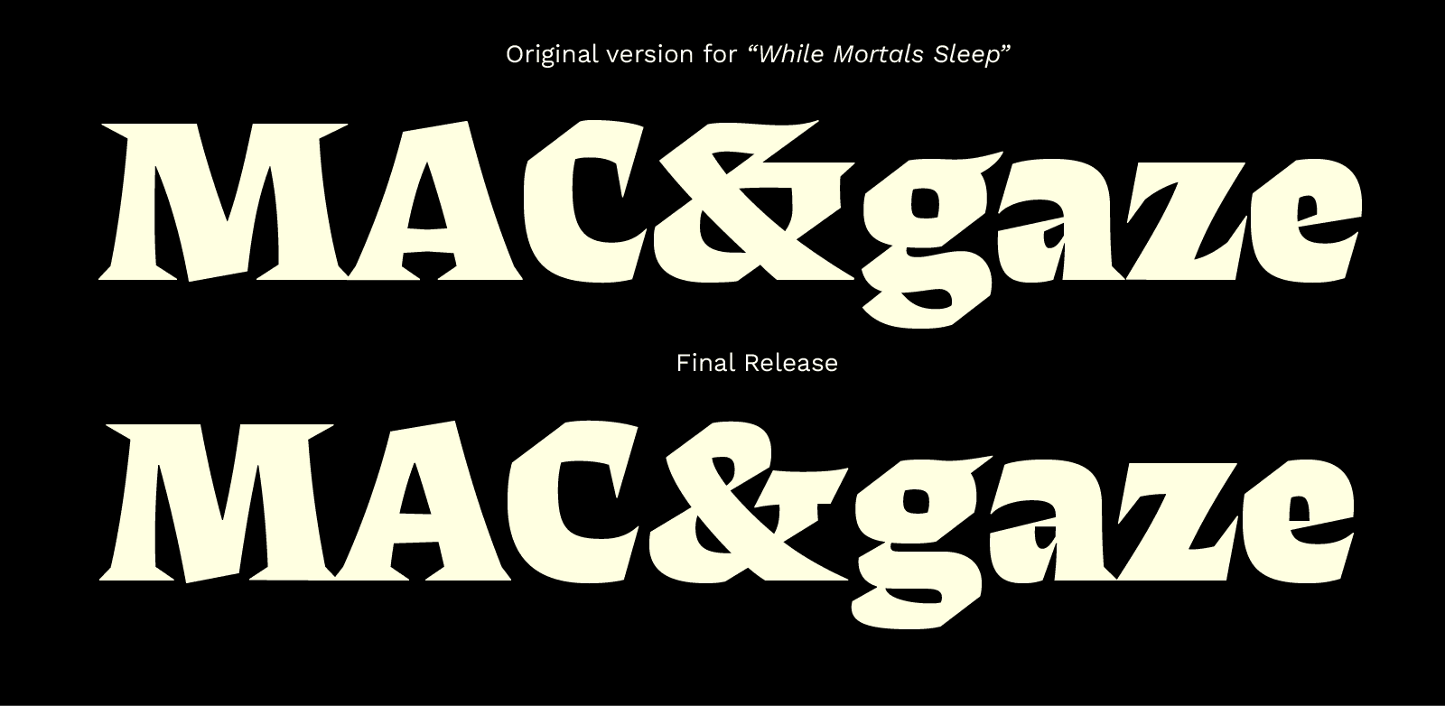
Spot the differences.
Even when spending time away from your work, it can be hard to spot issues—after all, it is your own mind that created this, and self-reflection is tricky for the unenlightened. That’s why an outside perspective is ever valuable, and who better than a man who draws an entire typeface every month?
David Jonathan Ross kindly took some time to give me feedback towards the end of Thanatos’ design process, and I can thank him for turning it from good to great. Some of his most valued suggestions were a change to the Roman lowercase “a” and “e”, to the oldstyle figures (which really weren’t working, but I couldn’t see why), and to widening the proportions of the text style. Thanks again, DJR!
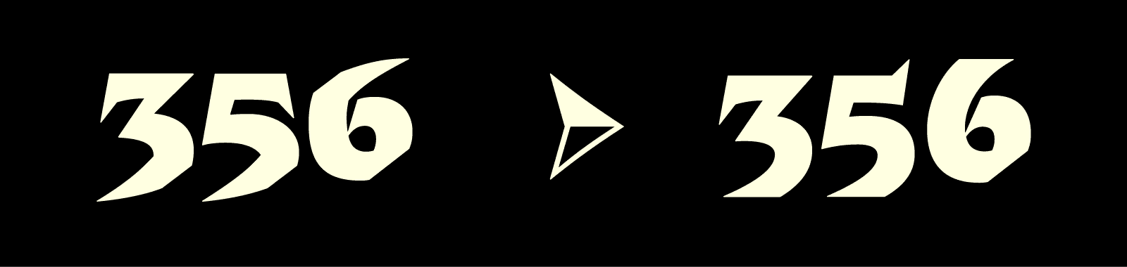
Oldstyle figures before and after DJR’s feedback, just one of many useful suggestions he kindly provided.
Arche-types
Oh yeah, what about that name, “Thanatos”?
A while back I released Libido, which was named after the life-drive as described by Freud and Jung; the force within us that leads us to creation, be it offspring or art. While I might stress that this is all pure pseudo-science, it's still fun to consider on a philosophical level.
The antipode of the Libido (or Eros) is the Thanatos: the death-drive, named after a Greek God of gentle death. It is a deeper instinct, which overrides our Libido as a compulsion towards our final destination. As Freud called it: “An urge in organic life to restore an earlier state of things”. Our Thanatos drives us to hurt and destroy—an important instinct for hunters and predators. But even in the most peaceful people, it serves an important function: to help us recover from trauma, and allowing us to accept the mortality of ourselves and loved ones.
And hey, while such discussions arguably surpass the scope of a pretty typeface, meaning isn’t inherently found in any object—it comes from what we ascribe to it. Much like how the scariest horror films reveal little and leave it to the imagination to frighten itself, do we assign meaning to shapes and symbols (and fonts) based on our own experiences and feelings. So, ladies and gentlemen, cower in terror as you behold: Thanatos.
My gratitude to David Jonathan Ross and Sebastian Carrewey for their feedback, to Alex Fofonoff for commissioning Thanatos, and to my wife Katie for her support and love.